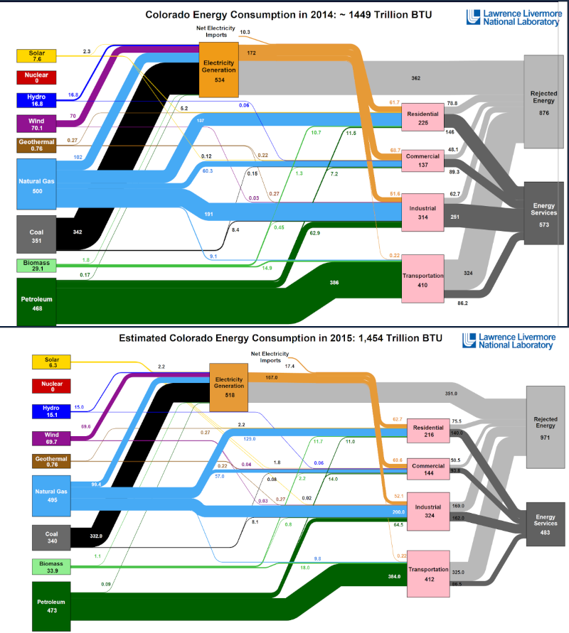
Energy flow diagrams

This page at Laurence Livermore National Laboratory is a great time waster. I recommend looking at the following geographies for different years: Texas <-- industry has become less efficient? California <-- not much change, despite the perception of them being a greening economy Iceland <-- it helps to live on top of submerged volcanoes Tanzania <-- huge country, they use no energy, and what they do use comes from biomass. Saudi Arabia <-- no surprise Canada <-- spot the oil sands gas consumption! China is ten times bigger than Canada as far as energy goes, in almost all aspects. Yet their population is almost 40 times more. It's our SUVs and shopping malls! If you squint just right at some location over a decade, you can see North America replacing coal with natural gas. Alternative sources are making some headway, but aren't significant (yet?). One thing I don't understand is why there is more rejected energy, or wasted energy now compared to a dec...